Solutions
Your first hunt, live this afternoon.
Free to start · No download for participants
Explore trade show booth ideas with standout examples, selection guidance, setup steps, mistakes to avoid, and ideas you can adapt quickly. Choose confidently.
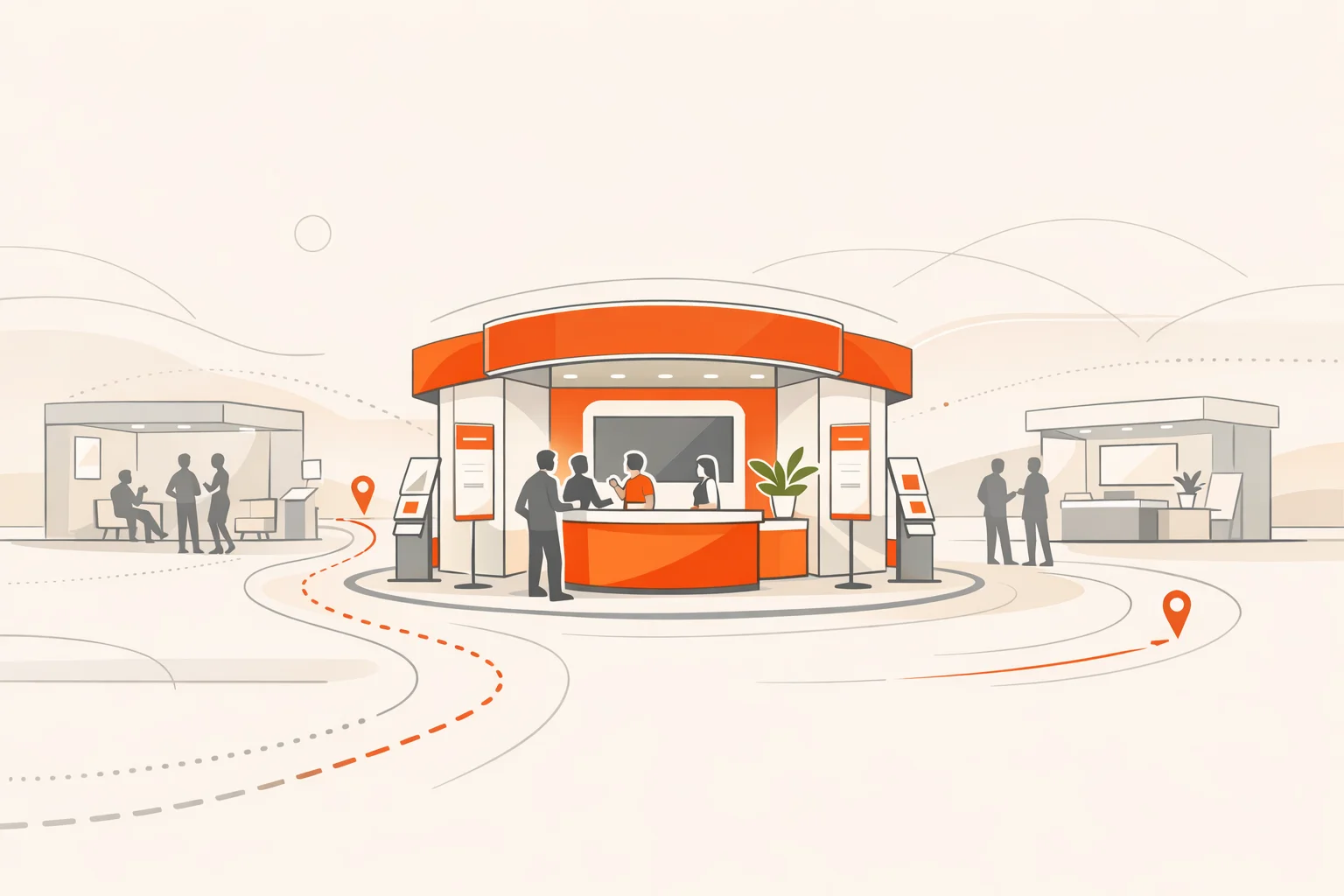
Trade show floors in 2026 reward clarity, motion, and genuine usefulness. Attendees walk fast and make snap decisions. What reliably stops them isn’t spectacle. It’s the promise of getting something done in the next few minutes. A good booth makes that obvious from the aisle and then delivers without friction.
Patterns we keep seeing: simple messages beat clever slogans, spaces with defined jobs outperform open mush, and live activity outpulls static walls. The ideas below are built for that reality. Steal what fits, skip what doesn’t, and combine a few into one coherent flow.
Most shows publish exhibit rules and height limits. In North America, many reference the widely adopted IAEE Guidelines for Display Rules and Regulations. Build to those constraints from the start. Treat accessibility as a core requirement, using the ADA National Network’s temporary events planning guide and the DOJ’s 2010 ADA Standards for Accessible Design to shape aisles, counters, and messaging.
Pick three outcomes before you pick a fabricator. Examples: fill 30 pre‑booked meetings, collect 100 qualified diagnostics, or run 50 hands‑on demos. Then choose ideas that make those outcomes the default behavior.
External research keeps landing on the same conclusion: attendees prioritize accomplishing their goals over spectacle. Freeman’s recent trends work crystallizes it and ties it to retention expectations (attendees come to accomplish goals). For floor layout and engagement zones, CEIR’s series on maximizing engagement on the exhibition floor is a practical reference.
Simple, concrete promises pull people in. Big claims without a plan push them past.
Lead with one thing you’ll help people do right now. Example: “Get a 3‑minute audit of your data handoffs.” Put it on the aisle edge and back it up with a visible, repeatable process.
A short, silent‑first loop draws the glance, then the body. Make it continuous so no one has to wait for a start. Add captions large enough to read from the aisle.
Paint or carpet a narrow path that ends at a staffed quick‑answer counter. It signals speed and respects people who don’t want the full tour.
Keep your magnet functions on the aisle where strangers decide. Put seated consults a few steps deeper. Most teams try to mix both in one space and create traffic jams.
Line up three to five real choices people can touch, test, or compare. Add simple labels that read like actions, not features.
A lightweight game sends people to key stations and makes data capture natural. It works for conferences and expo floors because it turns passive browsing into intentional motion. If you want to accelerate setup, a modern scavenger hunt app makes it easy to build, run, and score without extra hardware.
Post times on a placard and stick to them. Predictability beats surprise. Use headsets when the hall is loud.
Replace dense copy with a left‑to‑right journey: problem scenes, customer artifacts, and one transformation per panel. Let people choose depth.
Hands choose faster than eyes. Give three modular choices, price ranges, and a print or text‑to‑self summary.
If meetings are core, protect them. A small enclosed pod tells your calendar you’re serious. It also stops the “we’ll talk later” slide.
Where people wait, minds wander. Fill that time with one clear case summary, not a collage of logos. Feature the outcome in big type.
A real object beats a brochure. If you sell software, put a task‑based touchscreen on the aisle with only two steps before success.
Show “bad vs better” materials, finishes, or outcomes. Nothing explains like the feel of a warped part next to a correct one.
Turn attendee problems into simple sketched maps. People gather to watch ideas take shape, and the drawings make easy takeaways.
Name the expert, pick two windows a day, and pre‑collect questions with a QR. Crowd forms, conversations start, credibility rises.
Pick one metric that matters to your buyers and print it big. Then prove it three ways nearby. Keep it honest and defensible.
A standing counter with fast chargers buys dwell time. Don’t brand the whole thing. Put one practical worksheet or selector where hands rest.
Display the broken, rusted, mis‑installed, or outdated. It disarms defensiveness and opens real talk about the work.
Short, specific, scored. Show the result on paper or phone instantly. Use the outcome to route people to the right staffer.
Side‑by‑side runs with clear differences. Keep it short and predictable so passers‑by see the moment of change without waiting.
Let people bend, weigh, heat, cool, or stress test. Safety first. When people play, they remember.
If your content matters, make it watchable. Headsets kill noise and raise perceived value. Keep sessions under 12 minutes.
Bring the real thing: a component, a logbook, a customer’s annotated plan. Objects beat PDFs every time.
If you replace an incumbent, show the path. Five boxes. Two dates. One owner. People convert when they can see the road.
Coordinate three complementary booths with a tiny incentive for visiting all three. Useful motion beats random wandering.
On‑demand one‑pagers with only what someone asked for. Less waste, more relevance. Email or text it to them instead of a tote.
A grid of “if this, do that.” Make it tactical and non‑salesy. People take photos, share, and return with colleagues.
Let attendees watch setup, QA, or repairs. A little transparency builds a lot of trust.
Give your best seller a pen and two napkins. One for costs, one for outcomes. Snap and send. Simple math lands better than slide decks.
Three customers, eight minutes, one prompt. Keep it tight. Attendees believe peers more than vendors.
Show aggregate results from diagnostics, demos, or scan points. Real‑time numbers prove activity without bragging.
Architects do it. Engineers do it. Marketers can too. Short, real reviews make you useful and memorable.
Take something apart on schedule. People lean in when they see insides and mechanisms.
Invite the hard questions. A trained concierge who knows the landscape earns trust and accelerates deals.
Light, intentional cues help people notice. Overdo it and they leave. Less is plenty.
A subtle texture change at the boundary of your magnet zone makes feet pause. That pause starts conversations.
Give people a short shot list to capture across your space. Photos travel further than brochures.
List your material choices, reusables, and shipping decisions. Treat sustainability as design, not PR. If relevant, align with UFI and organizer expectations seen across recent industry trend recaps.
When a qualified handoff happens, a small chime and a quiet cheer energize the team. It’s culture, not theater.
One counter, one form, one path forward. Book meetings, ship samples, or trigger a pilot with no extra clicks.
Booth design sets the stage. People drive outcomes. Industry guidance and exhibitor playbooks consistently point to staffing quality as the biggest lever on results. Several mainstream resources reinforce the basics: role clarity, pre‑show training, and right‑sized shifts (staffing for success primer). Keep your team in rhythm with three elements:
Decide in advance what a “win” means. For many teams, it’s a mix of qualified meetings held, diagnostics completed, and pilots started, not just scans. Benchmarks vary, but the pattern is stable: build measurement into the activity. Industry roundups from Event Marketer and partners show measurement maturing across engagement, sentiment, and revenue impact (B2B events datapoints; experiential marketing statistics). Freeman’s trends work suggests attendees reward experiences that help them progress, and that “peak moments” correlate with return intent (trend recap).
What size booth do I need to execute these ideas well
Most ideas above scale from 10×10 to island. The constraint isn’t size. It’s clarity. If you can’t fit one obvious action and one meeting spot, simplify.
How many staff should I schedule
Plan enough people to keep the aisle magnet active while meetings continue uninterrupted. Assign roles and enforce breaks. Understaffing kills momentum faster than small footprints.
How do I make my booth accessible without blowing the layout
Design aisles and counters with accessibility in mind from day one, using the ADA National Network’s temporary events guide and the DOJ’s 2010 Standards. Accessibility and flow improve each other.
What should I measure besides badge scans
Track scheduled meetings held, diagnostics completed, demos run, opt‑ins for next steps, and time to first post‑show response. Those behaviors tie directly to pipeline.
How do I drive pre‑show interest so the booth isn’t doing all the work
Publish your micro‑schedule, promise a fast win, and invite prospects to specific moments. Industry surveys aggregate that planned moments and clear outcomes increase turnout (compiled datapoints).
Are live sessions worth the hassle
Yes, when short and predictable. Use headsets, post times, and repeat the same tight lesson. This format consistently pulls a crowd in high‑noise halls (PCMA case).
Do these ideas still apply if my product is complex
Even more so. Complex solutions benefit from a clear front‑of‑booth promise, a simple diagnostic, and a protected meeting pod. Clarity reduces friction and invites the right conversations.
Where can I find credible rules and research to guide design choices
Start with the IAEE display rules for structural constraints, CEIR’s engagement series for floor‑level behaviors, and Freeman’s latest attendee insights for what people actually value.
The right booth isn’t louder. It’s clearer. Pick three moves, rehearse them, and make progress the default outcome for everyone who stops by.